Blog

Getting Started with Responsive Web Design

If you’ve been reading my posts for a little while then you may know I’ve been refreshing my website recently. I wrote a little bit about it a couple of months ago. One of the things I’m doing in this iteration that I haven’t looked at before is following the principles of responsive web design (RWD). If HTML and CSS are the primary mediums you work in then you’ll already know lots about RWD, and you’ll know that it certainly isn’t a new concept. If you’re more like me and you dabble in building websites from time to time then you’ve probably heard the term, but you may not know too much about it. Keep calm and read on.

Before I really even knew what RWD was all about it, I’d heard it described as a paradigm shift in web authoring equivalent to the one that occurred when we all stopped using the <table> element for layout and started throwing our content in <div>s instead, using CSS to position them correctly. This comparison is almost solely responsible for me being so late to the RWD party: I’ve always recognized why using tables to lay out content was not the best approach, but switching to CSS was not an enjoyable transition for me. To this day there are things I could easily do with a table-based layout that I’d struggle with in CSS (vertically centered content, anyone?). On top of that IE6 was prevalent at the time and it has a well publicised complete misunderstanding of how the CSS box model is supposed to work, meaning back in the day you basically had to code everything twice – once for non-Microsoft browsers, and then again for IE6, with a bunch of hacks in place to make things look consistent across all platforms.

I had no particular desire to put myself through that kind of learning curve again just for the sake of a simple personal site. Luckily I did decide to learn more, because RWD is not that scary. It’s true that it represents a paradigm shift in thinking, but under the hood it’s an evolution of the CSS skills you already have, not a revolution. Allow me, if you will, to take you through it.

What does it mean to for a design to be “responsive?”

To answer my own question, let’s take a step back and look at the problem that RWD addresses. I guarantee it’s one you’ve come across even if you’ve never built a website in your life.

When I first published something to the web, I assumed visitors to my site had a screen resolution of 640×480. Most did at the time. Some people had pushed the boat out and had hardware capable of 800×600, but if they visited then I just didn’t use their all of their available screen real-estate. No big deal. Eventually things evolved and it was safe to assume that the majority of people browsing the web were doing so in at least 800×600, and then 1024×768… and that’s where it seems to have stopped. If you look at most sites on the web today they’re built with a fixed horizontal resolution of about 900 pixels in mind. If your display is better than that, you get some empty space (the display I’m using right now has a horizontal resolution of more than double that, for example: 1920 pixels), and if your display is capable of less you get a scrollbar across the bottom. But that’s OK. It’s pretty unlikely your display is less than 900 pixels across these days.

But wait, is that true? A significant percentage of the people that read this will be doing so on a mobile device. If you’re using Apple’s ubiquitous iPhone and you’re holding it in a portrait orientation then you’re probably looking at this with a horizontal screen resolution of 640 pixels right now. Of course Apple is smart. They knew when they launched the iPhone that users would want to look at regular web content, so they built their software with that in mind. When you visit a typical desktop site on your phone it’s all zoomed out so you can see the entire page width, and then you pinch or double-tap to zoom in on the part you want to read. They also knew that web developers would be quick to catch up, so they built-in some standards that would allow for this behaviour to be overridden if the page was designed to work on a lower-resolution device. Designers (and companies) were all over this, and began creating two versions of everything – one that would look great with a horizontal resolution of 640 pixels for mobile devices, and a second that would work great on desktop computers.

This is great, but I think with the benefit of hindsight everybody can see how short-sighted they were being. The original iPhone had a screen resolution of 320×480, the iPhone 4 upped this to 640×960, the iPhone 5 uses 640×1136. Now let’s add the iPad into the equation. All those special iPhone versions of sites don’t look so great when you scale them up to a larger screen, so what do we do now? Design a third version of every site that works on tablets?

No. We stop the madness.

Clearly what we need here is one version of a website that works well and looks good regardless of the screen resolution and device that’s being used, and that’s the problem RWD solves. Crucially, it lets us do so in an intelligent way, by letting us use the same HTML but apply subtly (or even radically, if we want) different CSS to it depending on the dimensions of the users browser.

How is this magic possible?

At its heart this is extremely simple: stop using pixels to define element sizes and start using percentages instead.

Personally I find the easiest way to do this is to create an initial design that’s 1000 pixels wide. Then you simply divide by 10 to get a percentage. So a simple two-column layout would change from

#header {width: 1000px}
#navigation {float: left; width: 200px}
#content {float: right; width: 800px}

To

#header {width: 100%}
#navigation {float: left; width: 20%}
#content {float: right; width: 80%}

One quick note at this point: remember that we’re talking about percentages of the container element here. In the simple example above the container element is the <body> so it’s nice and simple, but if we have three 250px wide columns inside our #content element (with two 25px borders between them) then we can’t divide by the 1000px body-width to get a percentage, we need to divide by the 800px #content width.

250px / 800px = 31.25%

As humans it’s tempting to round numbers like that to, say, 31%. Don’t! It may look neater, but your computer will benefit from the added precision.

I could see this working for big resolutions, but surely it breaks down on small-screen devices, no?

Yes. But chill out, I’m only halfway done.

You’re right though, imaginary reader with all the questions. Using percentages is great and it makes sure we’re using all the screen real-estate we have available. I no longer have half a screen of whitespace on my full-HD monitor, but let’s think in the other direction. What about the iPhone in a portrait orientation. It has a screen width of 640 pixels. So our two-column layout is

= 20% of 640px = 128 pixels
#content = 80% of 640px = 512 pixels

And our three columns within the #content element?

31.25% of 512px = 160 pixels

Those are some pretty narrow columns. Even if you can’t picture it based on the number of pixels, I’m sure you can picture what four columns of content would look like across the screen of your phone. Not great.

Enter CSS media queries

Now that we have a design that uses the full width of the device it’s displayed on, CSS media queries are the second major device in your RWD toolkit. You may already be using them without even knowing it. Do you have a line like this in the <head> of your page?

<link href='/assets/css/main.css' rel='stylesheet' type='text/css' media='screen'>

That last part where it says media=’screen’? That’s a media query. You may have a separate stylesheet that’s used when the page is printed (media=’print’). But media queries can do so much more!

At this point what you do with your CSS depends on your direction of thinking. I build my CSS for big screens and then progressively adjust for smaller devices, so I’m going to use the max-width media query. If you’ve started from a small screen and you’re going to be progressively enhancing for larger then the min-width query will be more helpful for you.

Regardless, here’s a simplified example of what our CSS might look like with the story we’ve told so far.

#header {width: 100%}
#navigation {float: left; width: 20%}
#content {float: right; width 80%}
#content .column {float: left; width 31.25%; margin: 0 3.125% 0 0}

Let’s think about those three columns in the content area first. As we think about narrower and narrower screens those columns are going to quickly become too narrow to be useful, so let’s address that first.

If the user has a screen width of 800 pixels or less, then lets give them one column within the content area instead. We append this rule to our CSS:

@media screen and (max-width: 800px) {
   #content .column {float: none; width: 100%; margin: 0 0 30px 0}
}

And it’s as simple as that! Now users with a screen width of 801 pixels or more see three columns of content and everybody else gets a single column with the three pieces of content one on top of another.

From here, we just add additional snippets of conditional CSS for each step down in screen resolution that we care to define. We still have two columns at this point (#navigation and #content). That may not be ideal if the user has a screen width of 640 pixels or less. So:

@media screen and (max-width: 640px) {
   #navigation {display: none;}
   #content {float: none; width: 100%}
}

Now our is gone and we probably need a smart solution to get it back on lower resolution devices (maybe a button the user clicks to show/hide it), but you get the idea.

These snippets will work progressively. On a device with a screen width of 600 pixels, for example, both of the above will apply – 600 is less than 640 and also less than 800.

And that’s really all there is to it!

A note about mobile browsers

As I noted earlier, mobile browsers typically emulate a screen resolution higher than the one they actually have available to them (by zooming out). We don’t want this behaviour here because we’re now designing with mobile in mind, but we can address that by adding the following line to the <head> section of our <html>.

<meta name="viewport" content="width=device-width,initial-scale=1">

See it in action!

I’ve put together a couple of quick demos so you can see this in action. To get the most from it you should view the demo on a computer, and then drag the browser window to make it wider and narrower to see how the page responds. Links will open in a new tab.

Blog

You are NOT a Software Engineer!

Interesting. I’m not a software engineer or a gardener, but this certainly rings true based on my own experience of working with IT. Of course, there’s a reason enterprise analysis exists as a discipline and warrants its own chapter in the BABOK

Chris Aitchison:

You are NOT a Software Engineer!

Blog

Try It!

Williams, Jason 5:40 PM
Is it lazy that I just pressed Fn-Space instead of getting off the sofa to turn on a light?

McCallum, Janice 5:40 PM
What does that do?

Williams, Jason 5:41 PM
Turns on a light.

Try it!

McCallum, Janice 5:41 PM
AMAZEBALLS

It is not lazy – it is awesome.

Williams, Jason 5:41 PM
Ctrl-Alt-DownArrow makes it brighter.

McCallum, Janice 5:41 PM
Nice try

Blog

Installing SharePoint Foundation in a VirtualBox Virtual Machine

For a while now I’ve been vaguely threatening to write a post or two about my work with SharePoint, but so far I haven’t actually managed to get around to it.

The reason is essentially simple: SharePoint is a huge tool my company makes available to me, and everybody else that works there. They installed and maintain it on their servers, and I am but a lowly user.

That’s fine. The whole point of the development work I do on top of SharePoint is that anybody could do it. I don’t need any special admin rights and I don’t need to get the technical guys involved. The problem is that when it comes to blogging about my work on SharePoint, all my work is on my company’s internal intranet. If I wanted a SharePoint site for testing purposes I’d have to put a request in and I’m not sure it would be approved, I don’t want to build test things on an existing site, and I certainly don’t want to risk accidentally revealing some proprietary information in a screenshot or something.

So, I’m going to install my own copy of SharePoint in a virtual machine and take you through it in this blog post.

Wait, what? Why?

SharePoint server is a big, enterprise-grade tool that powers intranet and internet sites across the world. Why would I want to install it at home? Well aside from using it to blog about my work, I plan on using it to help me work.

When I develop new SharePoint tools for my job I keep then hidden at the start. It’s kind of a security-through-obscurity type deal, and even though I’m typically developing on a live site your average SharePoint user won’t find what you’re working on if there isn’t a link to it on their screen. This is great when you’re launching new things, but if you want to update a tool that’s already been rolled out and is in use it presents some challenges. What do you do in this situation? The choices are either to create an entirely new version of the tool and possibly a duplicate of the data that powers it, or just bite the bullet and make changes to the live production code. I’d rather have my own sandbox environment I can play in without fear of breaking something.

Isn’t SharePoint server expensive?

Yes. But also no! There’s a version called SharePoint Foundation that Microsoft makes available for free, and it’s perfect for our needs. It’s designed to run on Windows Server 2008 or 2012, but it can also be installed on 64-bit versions of Vista or Windows 7, which is what I’m going to do.

Why a virtual machine?

To setup SharePoint server you do need to install some pre-requisites and change some operating system options, and I don’t want to do that on my desktop computer.

OK, I’m in. Let’s go!

Great!

Start by downloading and installing some virtualization software. My environment of choice is VirtualBox so that’s what I’m going to be using. If you don’t have an existing preference for something else, then I’d recommend you do the same.

Creating the VirtualBox VM

  1. Open VirtualBox and hit the new button in the top left
  2. Give your virtual machine a name, select the correct OS type (Microsoft Windows) and version (Windows 7 64 Bit), and hit next.
    image
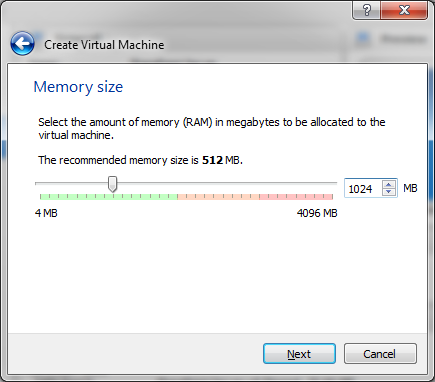
  3. Set the VM’s memory size. Microsoft says SharePoint foundation requires 4gb of RAM. In a bold decision that may come back to bite me later on, I’m going to give it 1gb.
    image
  4. Complete the remainder of the VM provisioning with the default options. You’ll end up with a 25gb virtual hard drive, but it’s dynamically sized so it won’t take up 25gb of your real-life hard drive.
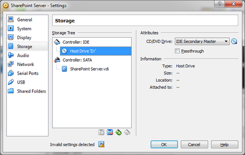
  5. Your now back to the main VirtualBox window, and your virtual machine has been created – but is empty.  It’s time to install Windows 7. Right-click your new virtual machine at the left of the VirtualBox window, go to the storage tab, select the DVD drive and click the little disc icon on the far-right of the window to point the virtual drive to the Windows 7 install media. This could be a physical disc in your drive, or an ISO disc image.
    image
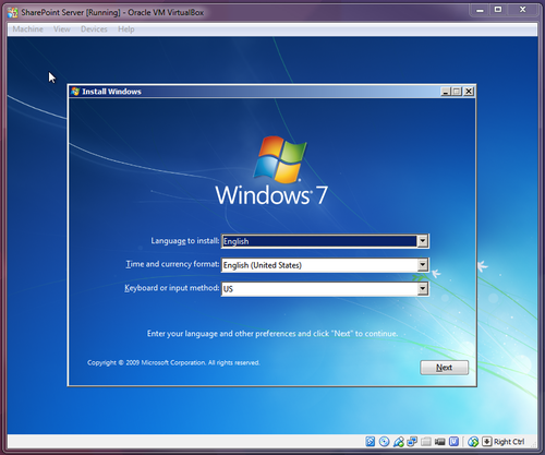
  6. Back at the main VirtualBox window, hit the start button up top. The virtual machine will open, and the windows install will begin. I’m not going to take you through all the install steps, but it’s no different to installing Windows 7 on a real computer. When you create a user you can call it whatever you want, but you must set a password.
    image

Installing prerequisites and configuring windows

image

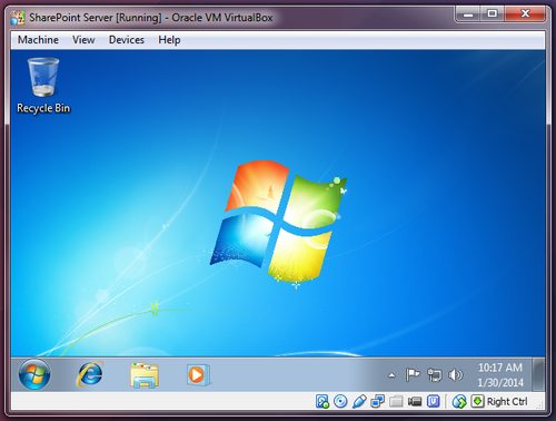
Now that we have Windows 7 installed and running in our virtual machine, it’s time to install a few prerequisites before we dive into installing SharePoint itself.

If you’ve already downloaded SharePoint Foundation then you may have noticed it includes an option entitled Install Prerequisites. Bad news – this only works on Windows Server and not Windows 7 or Vista, so you have some work to do.

You’ll need to download and install:

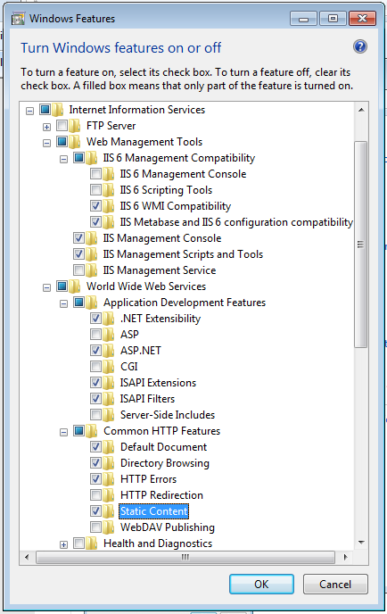
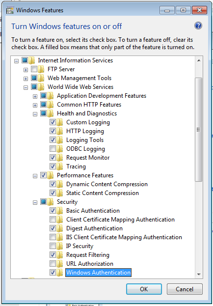
Next, we need to set a few options in the operating system. Open up control panel and go to Turn Windows features on or off.

Here are the options we’re going to set:
image
image

Time to install SharePoint

Finally, we’re ready!

  1. If you haven’t done so already, download SharePoint Foundation 2010 from Microsoft’s website. Make sure you save the file rather than running it, because…
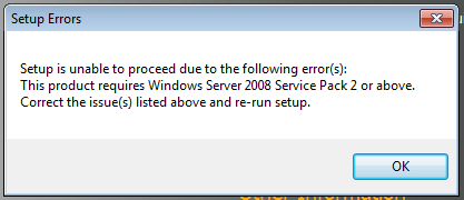
  2. …running it doesn’t work. As I noted, SharePoint is designed to be a server application available to large groups of people, and it requires Windows Server as a result. Except it doesn’t. Read on.
    image
  3. What we need to do is manually unpack the installation file, and change a setting before we can install.
    1. Move the downloaded file into a folder somewhere (on your desktop is fine), open a command prompt, and navigate to that folder.
    2. Type the following command, and extract the files from the archive into the same folder
      SharePoint_SP2_en-us /extract

      image

    3. The installation files are now extracted into the folder. Navigate to the FilesSetup folder. There’s a file in there called config.xml. Open this with a text editor (notepad is fine)
    4. Inside the <Configuration> tag, paste the following line:
      <Setting id=”AllowWindowsClientInstall” Value=”True” />

      Save and close the file, and navigate back to the root of the folder you created.

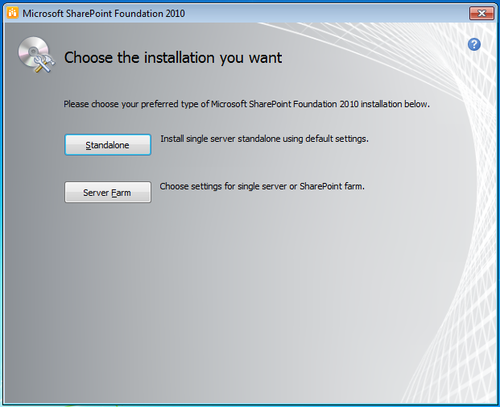
  4. Run setup.exe by double-clicking, and we’re pretty much good to go! When asked to choose the installation you want, make sure you select Standalone
    image

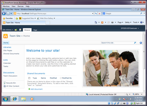
It may take a while, but if you’ve followed all the steps correctly, SharePoint Foundation 2010 will now install correctly. The final step of the installation is a configuration wizard. Don’t skip this step! Despite its name there are no options you need to select, but you do need to make sure that you run it. It will set everything up for you, and we’re done! When the configuration wizard is complete it will open the site automatically. You may need to log in with your windows username and password.

image   

Blog

As we were leaving the apartment this morning Flo told the dog that we were going “to work.”

I’ve spent weeks teaching him that work is something you do, not somewhere you go. We were going “to the office.”

Blog

Le Projet de 20% est Mort, Vive le Projet de 20%

Traditional proclemations aside, you may have read an article or two earlier in the year saying that Google has killed it’s “20% time” policy.

If you’re unfamiliar and you don’t feel much like clicking the above link, 20% time is…

“…a well-known part of our philosophy here [at Google], enabling engineers to spend one day a week working on projects that aren’t necessarily in our job descriptions.”

It’s well publicised that 20% time has been a significant contributing factor in giving us some of the Google products that we know and love today, so I hope for that reason that these rumors aren’t true. Regardless of that though, 20% time does seem at odds with the way the modern world works.

I’ve blogged a couple of times about ROWE so I’ll do my best not to digress into a further soliloquy about its merits here, but suffice to say I don’t measure my work in terms of time anymore. Allotting 20% of my time to projects that aren’t necessarily in my job description would be nearly impossible for me – not necesarilly because my organization wouldn’t allow it, but because I don’t know that I could figure out what 20% of my time is.

I’ve never worked somewhere with a policy of 20% time similar to Google, but that’s irrelevant. ROWE offers me something much better. I’m essentially free to use my time however I wish as long as the work gets done, and for me “20% projects” are absolutely a part of that.

Just because these 20% projects (as I’ll keep referring to them) aren’t right out of my job description doesn’t mean they aren’t work related, but they do offer me the freedom to try new things without fear of failure, and that leads to some great innovation (it leads to some failures and dead ends too, but that’s the point – it doesn’t matter).

I plan to blog some more about the gritty technical details in the not too distant future, but I’ve recently built a dashboard web-app on top of SharePoint using jQuery and SPServices. People love it, and it’s greatly increased my stock at work over the last few days. If my boss had come to me and asked me in a formal setting to develop this I don’t know if I’d have touched it. If it were a formal project from the start we’d have had to get IT to build it for us, probably at great expense. I, by contrast, learned how to do this stuff as I went along, and when I started work on it I had no idea if I’d be able to bring things to a successful conclusion.

My hope for my organization as ROWE becomes more of a popularised concept and way of working is that it encourages and enables other people to try new things – filter out the noise, spend less time doing and more time thinking. It worked for me, and it can work for you too.

Blog

Wave Goodbye

Not to long ago I wrote a post about why I believe it’s so important to build technology that supports business process, rather than building process that supports business technology. It got me thinking, curiously, about Google Wave.

If you’re not familiar with Google Wave, here’s Google’s very own 2009 video on the subject, Google Wave Overview.

What Google did with Wave was an entire re-imagining of email. Throw out everything that’s gone before, and redesign email (or rather, electronic business communication) from the ground up, the way it would look if it were conceived today, and we had today’s technology to take advantage of.

It was a huge failure.

Well actually only in the world of Google is a service with a reported 3 million active users a “huge failure” but still, you get the point. The service was shut down at the start of 2012.

The technology lives on and a lot of the development Google did for wave can today be found in Google Docs, Hangouts, and some other places too (it was all open source).

My friend and colleague Matt wrote some time ago about pilots and their place within proper project management (and the frequent misuse of the term and concept).

Would you run your personal finances this way? Would you buy a lawnmower and figure out how you’ll use it afterwards, even though you live in a high-rise condo? Of course not.

I’ve been trying to think of a corresponding analogy for what happened with Google Wave. I guess it would be that you wouldn’t buy a lawnmower that required you to replace your lawn. And didn’t let you invite friends and family to enjoy your yard with you unless they too had purchased a compatible lawnmower.

The problem, in real terms, was that Google had built a tool to replace email, but for early adopters (like me) it was a very lonely place. I couldn’t really use it because the people I wanted to communicate with didn’t use it.

Specifically what I believe Wave needed was backward compatibility with email somehow. Maybe Wave users would get to enjoy the advanced features Wave offered, but email users would also have a method to at least participate in the conversation until they too chose to adopt the better technology.

Let’s bring this all back to process management and development. I’ve never run or been a part of a process improvement initiative that didn’t being with current-state process mapping in one form or another. Improvements are usually iterative, but even if they’re not and we’re building from the ground up the conversation still involves a transition plan. I’m doing some process mapping work right now for a project which is all about the transition plan.

Quite what Google were thinking with Wave I’m not sure. They’re a technology company and they’re well known for trying innovative things and finding out later whether or not they work. I can therefore forgive them for being focused on technology rather than process, but it doesn’t make it less surprising to me that this particular experiment didn’t work out. Most organizations can’t (and shouldn’t) throw money at technology development the way Google does, so let’s make sure we’re spending our money wisely, thinking in a process-first way, and being specific about the need a particular technology is going to meet for us. If we don’t we’re going to end up with a lot of lawnmowers in high-rise condos.

I do miss Wave though, I thought it had the potential to become a fantastic tool. There are alternatives and derivatives out there, but for some reason they all seem to be very lonely places.

Blog

Art, and the Lost (to me) Art of Completing Things

I don’t run projects in my personal life the way I run projects at work.

My website is likely the worst offending example of this. There are many reasons why this is so – I can’t always commit time to personal projects in the same way as I do with work (work is always a higher priority), I’m accountable only to myself and it’s all to easy to let things slide, I get too emotionally invested what I’m doing and burn myself out, the list goes on and on.

The root cause though, at least as far as the website is concerned, is that I don’t even think about it as a project. I don’t wish to get too far up my own arse here, but I think of it as art. When will it be finished? I don’t even understand the question. It will never be “finished.”

I’m currently in the process of a redesign. This is a fairly common state of affairs for me. I’m always in the process of a redesign, seeking inspiration from my favourite gallery sites, plotting clever new ways to pull together and cohesively (and automatically) present the content I create daily all around the web, planning to refresh bits of outdated information (but I can’t just update it, I need to think about how to better present it and how that will fit into the redesign I’m also planning).

I’m determined that things will be different this time around for three reasons that build upon each other:

1. I’m going to avoid cutting-edge design

Cutting-edge design is fashion, and I don’t know fashion. I know what I like, and I’m certainly attracted to what’s new and fresh, but I’m no designer. I can take inspiration from other people’s cutting-edge work and pull it together into something of my own, but that’s about it (maybe that’s what designers do, and I am one. Fine, but we’re getting off-track here. I’m not a design innovator, then). The problem is that fashion moves too quickly for me to keep up, especially with the pace at which I work on these things. What I end up with is a design that looks out of date before I even get around to finishing it.

2. “Fuck It, Ship It”

You’ll have to excuse the language, it came from elsewhere. This brief article sums up the philosophy here. Too many times I throw out work in progress and start over from scratch because what I see on my screen doesn’t meet my exacting standards of perfection.

3. I’m not, in fact, creating “art” here

Let’s inject a little realism, shall we? I’m not crafting a work of art, I’m building a little personal website that probably attracts no more than a dozen visitors each month. I don’t need to do the kind of work you’d see from a New York design agency – it should be simpler, and it should be something that reaches a conclusion.

The Point

I don’t want to be designing my website, I want to be using my website and publishing things to it.

You’re probably reading this post at it’s original tumblr address, and it’s probably displayed using a generic tumblr theme I picked almost at random. Both of those things will change as I work through the project and this content will become part of the site, both in terms of design and in terms of it’s URL. But I’m not waiting for things to be pixel-perfect before I start writing and publishing. Fuck it, it’s shipped.

We’ll see how I get on.