Blog

The Golden Ratio: Design’s Biggest Myth

The other day I watched a Criminal Minds episode where the BAU rescued some potential victims of a serial killer mathematician by using the golden ratio and the related Fibonacci sequence (or rather, by identifying and understanding the killer’s use of them).

It was an interesting episode. When I decided I wanted to read a little more about the golden ratio I found the article linked above, and that was an interesting read too.

I’ve used the golden ratio in design (indeed, if you’re reading this by visiting my site on a large-screened device then the proportions of the left and right columns match the golden ratio).

Is it more aesthetically pleasing than different proportions would be? That’s the problem with things like this that are said to impact us at a subconscious level, my conscious mind doesn’t know.

The Golden Ratio: Design’s Biggest Myth

Blog

Server Commoditization

I’ve had a personal website of one description or another
for a long time now. For much of that time, the site was hosted by renting
space on someone else’s large server – so called “shared hosting.”

The theoretical problem with this model was that the
server’s resources were shared between all its users, and if one user chewed
through a whole lot of them then that left fewer available for everyone else.
I’m not sure I ever actually experienced this (although I’m sure it really was
an issue for web hosting companies to contend with), but the problem I did come
across was that to protect against this kind of thing hosts often put policies
and configuration options in place that were very restrictive. Related to this
is the fact that server configuration options apply to everyone with space on
that server, and they’re not for individual users to control. A problem if you
want to do anything that deviates even slightly from the common-case.

The alternative to shared webhosting would have been to rent
an entire server. This was – and still is – an expensive undertaking. It also
was – and still is – far more power than I need in order to host my website.
Sure, it’s possible to build a lower-powered (cheaper) server, but the act and
cost of putting it in a datacentre to open it up to wider world mean that it’s
probably not a worthwhile exercise to do all that with low-cost hardware.

What seems to me like not very long ago, virtualization
technology took off and created a market for virtual private servers (VPSs).
This allowed server owners to divide their hardware up between users, but in
contrast to shared hosting each user gets something that’s functionally
indistinguishable from a real hardware computer. They can configure it however
they wish, and it comes with a guaranteed chunk of resources: heavy usage of
one of the virtual machines hosted on the server does not negatively impact the
performance of any of the others.

This is the model under which my website is currently
hosted. I’ve chosen a low-powered VPS because that’s all I need, but recently
as my site has started to see more traffic it occasionally sees spikes in
incoming traffic that tax its limited memory and processing resources. I use CloudFlare as a service to balance this
out, mitigate threats, easily implement end-user caching policies and generally
improve speeds (particularly for those users that a geographically far away
from the server), but once my server resources are maxed there’s nothing I can
do about it: my host has divided the server up into VPS’s of a predefined size,
and doesn’t allow me to grow or shrink the server along with my needs.

The new paradigm is an evolution of this. Instead of
dividing each bare-metal server up into predefined VPS chunks, each server is a
pool of resources within which VPSs of various sizes are automatically
provisioned according to customer requirements. Behind the scenes, technology
has grown to make this easier, especially when you scale the story up to more
than one bare-metal server. A pool of physical servers can also pool resources.
If a VPS hosted on one physical server needs to grow beyond the remaining
available resources of its host, it can be invisibly moved to another host
while it’s still running and then its resources expanded.

This new paradigm is the one I plan to move to. Led by the
likes of Amazon and Google and now followed in the marketplace
by lower-cost providers like DigitalOcean
and Vultr (likely to be my
provider of choice), servers have really become commodity items that can be
created and destroyed at will. You used to rent servers/hosting by the month or
year, now it’s by the minute or hour. It’s common for hosting companies to
provide an API that lets you automate the processes involved – if my server
detects that it’s seeing a lot of traffic and is running low on resources it
could – with the right script implemented – autonomously decide to grow itself,
or maybe spin up a sibling to carry half the load. When things settle down it
can shrink itself back down or destroy any additional servers it created.

What a wonderful world we live in!

Blog

I’m Back!!

Did you miss me?

Hopefully you didn’t even notice I was gone, but two days ago Tumblr terminated my account, removing this blog and Shrapnel from the internet. I immediately contacted support as directed and heard back from them yesterday evening: my account had been closed for contravening Tumblr’s community guidelines in relation to spamming and affiliate marketing.

I replied to make the point that at no point have I engaged in spamming or affiliate marketing, and apparently someone there agreed because I am now back online. The issue, as it turns out, was that my two Tumblr blogs were sending visitors back to jason.jnf.me (where I had a script that presented the blog content in a subfolder, integrating it into the site to a much greater degree than a separate domain would).

In the short-term I’ve removed the redirect by simply resetting my blog’s theme to the default, and I’ll take some time on the weekend to restore the look and feel I had previously, and probably give each of them a custom subdomain.

In the longer term, I think it’s time to start looking for an alternative blogging platform. When it seemed as though all the content I had on this blog had disappeared I was extremely disappointed. I run my own server, so I probably shouldn’t be relying on third-party services anyway.

The obvious suggestion would be to install WordPress, and while that would work great for my blog content I think I’d have a hard time implementing some of the other site pages on that platform. What I want is a CMS (to give me the ability to quickly and easily manage and edit content) that lets me build custom bits and pieces (like my feed page) on top of it. I’ve chosen PyroCMS. It’s built on the CodeIgniter framework that I’ve previously used which should make for relatively easy extensibility. It’s going to take me some time, but I’ve installed it on my development server to start getting my hands dirty. I’m just happy I’m back online and I don’t have to spend this weekend trying to rebuild.

Blog

CloudFlare Adds SSL To All Customers In Advance Of Google’s Focus On Security

I’ve written recently about SSL and how you can enable it on your website without spending a lot of (or even any) money. I’m a big fan of Cloudflare and their free service offering, and this feature just makes it better still.

CloudFlare Adds SSL To All Customers In Advance Of Google’s Focus On Security

Blog

Publicly Trusted SSL on the Cheap

Last week I wrote about how to create a self-signed SSL certificate for your website. It turned out to be one of my popular posts, and the process turned out to be remarkably easy: you run one single command, make a quick change to your webserver configuration and you’re done.

Our self-signed certificate worked great for encrypting the connection between our browser and the webserver, but as I mentioned that’s only half the SSL story. Our certificate wasn’t trusted by our operating system, which means it couldn’t be used by our browser to confirm the identity of the server we’d connected to, which in turns means that visitors to our website are greeted with a big, bold “your connection is not secure” error message.

Our browser knows whether or not it can trust a given SSL certificate through a hierarchical structure. I’m glossing over some details, but essentially our operating system comes with a listed of trusted “root” certificates. The owners of these root certificates can produce certificates for their customers much as I produced one for myself last week. The difference is that there’s a mechanism for traceability here – the certificates they produce are trusted, because our browser can trace things back to the root certificate that it already knows to be good.

image

I’m not suggesting there’s some kind of conspiracy at play here, but it seems to me the owners of these root certificates have a metaphorical license to print money. They can create something out of nothing with, in essence, a single command, and sell it for a value they determine. I might be OK with that if they hadn’t determined that the value is so insanely high.

Luckily for us there are market forces at play in this whole story, and we don’t have to pony up the $1,500 Symantec are asking to secure our website traffic. We’re going to do it for free. Read on!

SSL Certificates and Their Value

Unfortunately, budget-minded certificate providers are few and far between, and the trend appears to be that their either disappearing or eliminating their lowest-cost options in favour of “better,” higher-priced ones. NameCheap is a good option if you’re looking to minimize costs, with certificates starting at around $10 at the time of writing.

But here’s the question: If you can get an SSL certificate from them for $10, why are Symantec charging $1,500. Is their option 150x better?

Here’s my answer: No.

Symantec would likely argue that point though, as you might imagine. They’d mention that they put their customers through a more stringent identification process in order to provide an increased level of confidence in their product. They know their customers, and they know they’re only issuing certificates to trustworthy sites. They’d argue they provide a warranty with their certificates that provides their customers with legal protection against a losses caused by a security breach.

This is all well and good, of course, but does the typical internet user care? I’d propose that the average site visitor – at best – notices the green padlock icon in the address bar and proceeds with confidence upon seeing it. How much you, as a site owner, pay to get that padlock icon really makes no difference to the vast majority of your visitors.

That all being said, it of course depends on what your site does. If you’re a bank, this is not an area you should be trying to save money in. Take the expensive certificate with the warranty and the legal protection. If you run an e-commerce site and your livelihood depends on your website then maybe don’t spend $1,500, but don’t accept the reputational risk of using a product with no warranty and limited support. If you’re me, though? Whatever, just spend as little money as possible.

Getting a Free SSL Certificate

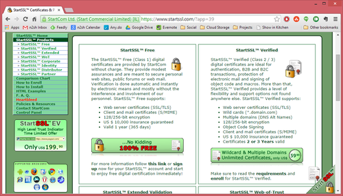
Enter our new best friends at StartSSL. They offer single-site SSL certificates for the extremely reasonable price of free. There are some caveats as you might expect, but none of them are a show-stopper for my purposes. Nevertheless the biggest thing you should consider is that although they’ll issue the certificate for free, you will have to pay if you ever need to revoke it. If you ever suffer a security breach and suspect that your certificate file has fallen into the wrong hands (I’m talking about the equivalent of the server.pem file we created for ourselves last week), it should be revoked to prevent some nefarious person setting up a site that masquerades as yours. If there’s ever another vulnerability similar to the heartbleed bug then the certificate should likewise be revoked.

In a nutshell, this is a risk tolerance question. By taking the free certificate you’re betting that nothing bad will happen during the 12-month life of your certificate or that if it does you’ll be prepared to accept a whole host of new risks.

Since I was OK with the many drawbacks of using a self-signed certificate, I laugh in the face of risks like the ones mentioned above. If you’re different then do your homework and make sure you’re getting a product that’s right for you, but if you’re like me then tune in next week when I walk through the steps of getting a free certificate issued to me and install it on my server.

image

Blog

Creating a Self-Signed SSL Certificate for Lighttpd

You’ve probably heard of SSL, or at least know it from either the https:// prefix that you see when browsing certain websites or the padlock icon in your browser’s address bar that goes along with it.

image

You probably also know that this icon’s presence is an absolute must when you’re doing sensitive things on the internet, like online banking. Really though you should consider it a must on any site where you’re entering information that you wouldn’t want falling into the wrong hands – including your username and password for the site itself and anything you do on the site once you have logged in.

SSL does two important things: It encrypts the connection between your browser and the site’s webserver, meaning that if somebody had the ability to listen in to your internet traffic (which is actually frighteningly easy, especially if you’re using a public WiFi hotspot) then they won’t actually see any of your important personal details. SSL also provides identity verification for websites in order to thwart a more complex attack where your web traffic is somehow redirected to a fake version of the site. Today we’re going to tackle only the first part – encrypting the connection between the browser and my webserver, which is running lighttpd.

Recently I’ve created a web interface that allows me access to my documents from anywhere on the web. To log in I have to enter my user ID and password for my home network, and once I’m logged in I may want to open a file that includes some sensitive information. This whole interaction is something that should be protected end to end by SSL, so that’s precisely what I’m going to do.

Creating an SSL Certificate

Of the two things SSL can do for us (securing a connection and confirming the identity of the webserver we’re connected to), the first part is actually much easier than you might think. The problem (as we’ll discover), is that doing only that first part has some problems that make it unsuitable for a typical public website. More on that later, but in my scenario where I have a website that’s intended only for my use this will be an acceptable solution, and that’s what we’re going to do.

On the webserver, navigate to a directory where you’re going to store the SSL certificate file. This directory should not be web-accessible. We’re going to use OpenSSL to create our SSL certificate. OpenSSL is unfortunately best known for introducing the heartbleed bug that caused a panic in the not too distant past, so before you proceed make sure the version you have is not affected. The step we’re about to complete actually won’t be impacted even if your server is vulnerable to heartbleed, but the day to day use of any certificate on a vulnerable server is not safe.

Ready? Good. Type the following command:

openssl req -new -x509 -keyout server.pem -out server.pem -days 365 –nodes

OpenSSL will ask a few questions, the answers of which will form a part of the certificate we’re generating (and be visible to site visitors, if they choose to go looking for it). Everything is fairly self-explanatory with the possible exception of the Common Name field. Since we’re going to be using this certificate for web-based SSL, the Common Name must be the hostname (the full domain name, including the www prefix if you use it) of your website.

Country Name (2 letter code) [AU]:CA
State or Province Name (full name) [Some-State]:Alberta
Locality Name (eg, city) []:Calgary
Organization Name (eg, company) [Internet Widgits Pty Ltd]:JnF.me
Organizational Unit Name (eg, section) []:Hosting and web services
Common Name (eg, YOUR name) []:www.ssl-example.jnf.me
Email Address []:[email protected]

You’ll find that you now have a file called server.pem in your working folder, and that’s it! This is your SSL certificate that will be used to secure the connection.

Enabling SSL in Lighttpd

Now we need to configure our webserver to use SSL with the certificate we’ve just generated. As I noted, my webserver is lighttpd. If you’re using Apache, IIS, Nginx or something else then the steps you need to follow will be different.

For lighttpd, open up your lighttpd.conf file (typically found in /etc/lighttpd) and adjust your configuration similar to the following:

$SERVER["socket"] == ":80" {
   url.redirect = ("^/(.*)" => "https://www.ssl-example.jnf.me/$1") 
}

$SERVER["socket"] == ":443" 
   ssl.engine = "enable"
   ssl.pemfile = "/path/to/server.pem"
   server.document-root = "/path/to/web-root"
}

The first section identifies any traffic that reaches port 80 on our webserver (http), and redirects the user to the https version of the site. The second section applies to traffic reaching port 443 (https), enables lighttpd’s SSL engine and provides the paths to the server.pem file that we generated, and the appropriate content.

Restart lighttpd for the changes to take effect:

sudo /etc/init.d/lighttpd restart

And that’s it! Traffic to our site is now encrypted using SSL.

Identity Verification

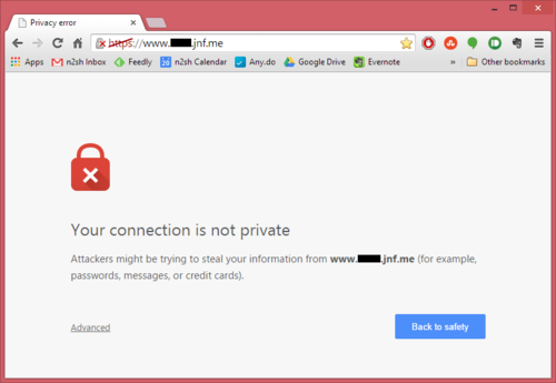
As I alluded to earlier in the article though, there’s a problem. When you navigate to the site in your browser you see (depending on your browser of choice) something similar to the following on your screen.

image

It’s not particularly specific, but clearly Chrome has an issue with our setup.

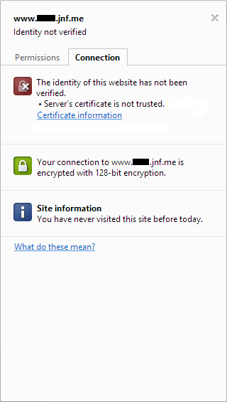
The problem here is the one I alluded to earlier, and if you click the padlock icon in the address bar then Chrome will give you some additional details that show you what I mean.

image

Our connection is indeed secured by SSL as we’d hoped, but Chrome has been unable to verify the identity of the website we’re connecting to. This is not a surprise – since we created the SSL certificate ourselves, our browser has no means of knowing if the certificate should be trusted or not. This is why self-signed certificates are not suitable for public, production websites.

Since this is site is going to me for my use only, I can live with it. The important thing is that my connection is encrypted, and if I hit the Advanced link then I have an option to ignore the warnings and proceed to the site. I don’t want to do that every time if I can avoid it though, and the solution is to add the site’s SSL certificate to your computer’s Trusted Root Certificate Authorities store. Chrome (on Windows) and Internet Explorer both use this same location when checking the validity of SSL certificates, so the easiest way to go about doing this is actually to open the site in Internet Explorer and then complete the following steps which I took from a helpful user on stackoverflow:

  1. Browse to the site whose certificate you want to trust.
  2. When told There is a problem with this website’s security certificate, choose Continue to this website (not recommended).
  3. Click on Certificate Error at the right of the address bar and select View certificates.
  4. Click on Install Certificate… then in the wizard, click Next.
  5. On the next page select Place all certificates in the following store.
  6. Click Browse, select Trusted Root Certification Authorities, and click OK.
  7. Back in the wizard, click Next, then Finish.
  8. If you get a security warning message box, click Yes.
  9. Dismiss the message box with OK.
  10. Restart your computer.
  11. When you return to the site in either internet explorer or Chrome, you should find that the certificate is now trusted.

All done!

Blog

Making Google Analytics Work for Me (and You)

When I put my website together back whenever it was that I did that, I knew I wanted to get analytics from it: at the beginning the site was fairly simple (this blog, for example, was an entirely separate entity back then and it wasn’t integrated into the site in the way it is today), but from the start I wanted to know how many visitors I was getting, where they were in the world, how they were finding me, and a little about how they were interacting with my site.

I’d used Google Analytics on past projects, but this time around I felt a little uneasy about providing Google with an easy way to gather data on all my site visitors. Those guys have enough power without me contributing. I went with clicky.com for my analytics, and all was well.

In researching this post I found an article called Seven Reasons Why You Should NOT Use Google Analytics. My concerns about giving Google too much power rank number four in their list, but they ultimately reach the same conclusion I did – Google’s product offering in this space is simply better than the alternatives out there, especially when you consider the price (free). With Clicky the basic service is free but limited – you need to fork over some cash if your site generates a lot of traffic, or you want to retain data for longer than 31 days, or add advanced features… the list goes on.

I switched back to Google’s service a couple of weeks ago and I haven’t looked back. While I was at it I not only added the relevant code to this site, I also added it to Flo’s blog and the jnf.me landing page. Clicky limited me to tracking a single site but Google doesn’t, so why not?

image

For a website like mine adding the relevant JavaScript to the site and then forgetting about it is a reasonable approach, but I’ve discovered very quickly that if you’re prepared to put in a little more effort then you can get much improved results. For me, this was highlighted by the extremely limited usefulness of the data I’ve been getting from JNF.me, but the way I’m solving that problem could apply anywhere. Read on!

The Problem

When I bought the domain jnf.me my primary concern was getting something short. My plan all along was to use sub-domains for the various bits of content that lived under it (www.jason.jnf.me, www.asiancwgrl.jnf.me, and so on). The J stands for Jason, the F for Flo, and the N for ‘n, but that’s not really relevant. Since it is the root of my domain, I knew I should put something there so I created a quick, fairly simple, single-page site. The page is divided into two with me on the left and Flo on the right, and if you click one of our faces then the whole thing slides over to reveal a little about us and some links to our online content.

In terms of analytics data, the very fact that this is a single-page site is what’s causing issues. With a larger like jason.jnf.me even taking the most basic approach to installing Google Analytics tells me, for example, that the average visitor views three pages. I know which pages are the most popular, which blog topics generate the most interest, and so on.

With JNF.me I know that people visit the page and then their next action is to leave again – but of course it is, there is only that one page.

What are they doing while they’re there? Are they leaving through one of the links on the page? I have no idea, but I can find out.

Manually Sending Pageviews

The first thing I opted to do was manually send a pageview to Google Analytics when somebody clicks one of our pictures to slide out the relevant content from the side of the page.

My rationale for this approach is that if this were a site with a more traditional design, clicking a link to view more content from the site would indeed cause another page to be loaded. The fact that my fancy design results in the content sliding in from the side instead really makes no difference.

The approach is extremely simple, and adding a single line of JavaScript to the code that makes the content slide in is all it took:

ga('send', 'pageview', {'page': '/' + p });

So how does this work? ga() is a function that Google Analytics creates when it’s first loaded by the page, and in fact if you’re using Google Analytics at all then you’re already using this. Let’s take a quick look at the code Google has you paste into your page in order to start feeding data to Analytics in the first place. It ends with these two lines:

ga('create', 'UA-XXXXXXXX-X', 'auto');
ga('send', 'pageview');

The first line initializes things and lets Google know (via the UA-XXXXXXXX-X bit) which Analytics account it’s going to be getting data for. The second line sends a pageview to Analytics because, well, if the code is being executed then that means somebody is viewing the page.

By default Analytics makes the perfectly reasonable assumption that the page that executes this code is the one it should be recording a pageview for, but here’s the thing: it doesn’t have be that way.

Back to my example, and you’ll notice I’ve added a third argument to the ga() function call. Google’s help page on the subject discusses the options in terms of possible parameters, but essentially what I’m doing is passing a JavaScript object that describes exactly what Analytics should track. The page field is the page address against which a pageview is registered, and the p variable is used elsewhere in my code that makes the sliding content work: it stands for person, and it contains either “jason” or “flo” as appropriate.

The important thing to note here is that these pages don’t exist – there is nothing on my website at either /jason or /flo – but this doesn’t matter. Analytics registers a pageview for one of these addresses anyway, and I know when I see it in my data that it means that somebody opened the sliding content.

Sending Events

In addition to sending pageviews to Analytics you can also send events, and this is the approach I took to help me understand how people are leaving the page.

When I first started learning about events I spent some time trying to understand the right way to use them. Google’s Event Tracking help page provides an example, and you can find some good reading material about it on the web. The conclusion I’ve reached from my brief research is that there is no “right” way to use events – you just define them in whatever way works best for you, your site, and your desired outcome.

The important thing to know is that events have, as a minimum, an associated category and action. You can also optionally define a label and a value.

I can see that the value parameter would be extremely useful in some scenarios, such as tracking e-commerce sales (you could, for example, use Analytics to track which traffic sources result in the highest sales figures in this way) but I don’t need that. I will be using the other three parameters, though.

When you view data regarding events in the Analytics interface, they’re in something of a hierarchical structure. Categories are treated separately from one another, but you can view summary data at the category level, then drill-down to segment that data by action, then drill down further to segment by label.

For the events fired when a site visitor clicks an external link on my page I arbitrarily decided that the category would be ‘extlink,’ the action would be the person the link relates to (either jason or flo), and the label would be indicative of the link destination itself (blog, twitter, etc).

To implement this, the first thing I did was add a class and a custom data attribute to the links on the page:

<a href="http://twitter.com/JayWll" class="outbound" data-track="jason/twitter">Twitter</a>

The class of outbound defines this as an outbound link as opposed to one of the links that helps visitors navigate around the page, slide content in and out, etc, and the data-track attribute defines what will become the event’s action and label.

Next, the JavaScript. This time around it’s slightly more in-depth than the single line of code we used to send a pageview. That’s not necessarily a function of events as compared to pageviews, but it’s due to the nature of what I’m tracking here: when a user clicks a link that takes them away from the current page, they (by default) leave immediately. In order to track outbound links, I actually need to hold them up and make sure the event is registered with Analytics before I let them go anywhere. Happily, Google has thought of that and the ga() function accepts a hitCallback property. This is a function that’s fired only once the event has been properly recorded.

Here’s my code:

$('a.outbound').click(function(e) {
   e.preventDefault();
   trURL = $(this).attr('data-track');
   nvURL = $(this).attr('href');

   ga('send', 'event', {
      'eventCategory': 'extlink',
      'eventAction': trURL.split('/')[0],
      'eventLabel': trURL.split('/')[1],
      'nonInteraction': 1,
      'hitCallback': function() {
         location.href = nvURL;
      }
   });
});

The first thing I do is prevent the link’s default behaviour with the line

e.preventDefault();

Next, I capture the link’s data-track and href attributes – we’ll need both of those later.

Finally, we’re back to the ga() function to send data to Analytics. We send an event, and define its parameters within the JavaScript object: the category is ‘extlink,’ the action and label are obtained by splitting the link’s data-track attribute, we define this as a non-interaction event (LMGTFY) and, once this data has been successfully sent, the hitCallback function is executed which takes us to the page specified by the link’s href attribute.

Easy, when you know how.

Taking it Further

The possibilities here are endless, and how use them really depends on your site and the data you’d like to get from it. My plan is to take some of what I’ve learned for jnf.me and extend it to this site, particularly in regards to event tracking.

In addition to tracking outbound links, I have two other ideas for how I might use this:

  1. Page length and scroll tracking
    Some of my posts – this one is potentially a prime example – are pretty long. I do tend to ramble on a bit at times. If a post is more than, say, two screen heights in length then I could track how many people scroll beyond the halfway point and how many people scroll to the end to help me understand if my audience is OK with long posts or if I should split in-depth content into some kind of mini-series.
  2. Form tracking
    There’s a contact me page on this site, and each post in this blog has a comment form at the bottom. With events I could gain a much better understanding of how these are working and how visitors interact with these forms. For example, do people begin filling out the contact me form but then abandon it at some point before submitting? Do people begin to write comments on my posts but then refrain from posting it when they find out I require them to at least provide their email address?

Hopefully you have ideas for how you can use these techniques to provide better insight into visitor behaviour on your site too. Come back here and leave a comment to let me know how it goes! I do require your email address for that, but I promise not to spam you or pass it on to any third party.

Blog

Comments, Likes and Reblogs

I made a few minor improvements to my custom tumblr theme last night, and the end result is that you can now comment on the stuff that I post here. Yay!

If you’re also on tumblr and you choose to like or reblog one of my posts then that shows up too. If you’re on the main page of the blog then a count appears just underneath the tags to the left of this text (assuming that there’s anything to count), and if you’ve clicked in to a post or followed a link from my twitter or elsewhere then there’s a more detailed listing of the tumblr love received toward the bottom of the page. This applies to both this blog and shrapnel, although shrapnel has no comments.

That being said, I haven’t made it easy to like, reblog or follow me. The specialised and complex nature of my exact setup (of course) means that the standard links for these functions that tumblr puts on the page don’t work, so I’ve turned them off altogether. Next on the to-do list is for me to bring them back, so watch out for that and show me some tumblr love when you see them.

Blog

Getting Started with Responsive Web Design

If you’ve been reading my posts for a little while then you may know I’ve been refreshing my website recently. I wrote a little bit about it a couple of months ago. One of the things I’m doing in this iteration that I haven’t looked at before is following the principles of responsive web design (RWD). If HTML and CSS are the primary mediums you work in then you’ll already know lots about RWD, and you’ll know that it certainly isn’t a new concept. If you’re more like me and you dabble in building websites from time to time then you’ve probably heard the term, but you may not know too much about it. Keep calm and read on.

Before I really even knew what RWD was all about it, I’d heard it described as a paradigm shift in web authoring equivalent to the one that occurred when we all stopped using the <table> element for layout and started throwing our content in <div>s instead, using CSS to position them correctly. This comparison is almost solely responsible for me being so late to the RWD party: I’ve always recognized why using tables to lay out content was not the best approach, but switching to CSS was not an enjoyable transition for me. To this day there are things I could easily do with a table-based layout that I’d struggle with in CSS (vertically centered content, anyone?). On top of that IE6 was prevalent at the time and it has a well publicised complete misunderstanding of how the CSS box model is supposed to work, meaning back in the day you basically had to code everything twice – once for non-Microsoft browsers, and then again for IE6, with a bunch of hacks in place to make things look consistent across all platforms.

I had no particular desire to put myself through that kind of learning curve again just for the sake of a simple personal site. Luckily I did decide to learn more, because RWD is not that scary. It’s true that it represents a paradigm shift in thinking, but under the hood it’s an evolution of the CSS skills you already have, not a revolution. Allow me, if you will, to take you through it.

What does it mean to for a design to be “responsive?”

To answer my own question, let’s take a step back and look at the problem that RWD addresses. I guarantee it’s one you’ve come across even if you’ve never built a website in your life.

When I first published something to the web, I assumed visitors to my site had a screen resolution of 640×480. Most did at the time. Some people had pushed the boat out and had hardware capable of 800×600, but if they visited then I just didn’t use their all of their available screen real-estate. No big deal. Eventually things evolved and it was safe to assume that the majority of people browsing the web were doing so in at least 800×600, and then 1024×768… and that’s where it seems to have stopped. If you look at most sites on the web today they’re built with a fixed horizontal resolution of about 900 pixels in mind. If your display is better than that, you get some empty space (the display I’m using right now has a horizontal resolution of more than double that, for example: 1920 pixels), and if your display is capable of less you get a scrollbar across the bottom. But that’s OK. It’s pretty unlikely your display is less than 900 pixels across these days.

But wait, is that true? A significant percentage of the people that read this will be doing so on a mobile device. If you’re using Apple’s ubiquitous iPhone and you’re holding it in a portrait orientation then you’re probably looking at this with a horizontal screen resolution of 640 pixels right now. Of course Apple is smart. They knew when they launched the iPhone that users would want to look at regular web content, so they built their software with that in mind. When you visit a typical desktop site on your phone it’s all zoomed out so you can see the entire page width, and then you pinch or double-tap to zoom in on the part you want to read. They also knew that web developers would be quick to catch up, so they built-in some standards that would allow for this behaviour to be overridden if the page was designed to work on a lower-resolution device. Designers (and companies) were all over this, and began creating two versions of everything – one that would look great with a horizontal resolution of 640 pixels for mobile devices, and a second that would work great on desktop computers.

This is great, but I think with the benefit of hindsight everybody can see how short-sighted they were being. The original iPhone had a screen resolution of 320×480, the iPhone 4 upped this to 640×960, the iPhone 5 uses 640×1136. Now let’s add the iPad into the equation. All those special iPhone versions of sites don’t look so great when you scale them up to a larger screen, so what do we do now? Design a third version of every site that works on tablets?

No. We stop the madness.

Clearly what we need here is one version of a website that works well and looks good regardless of the screen resolution and device that’s being used, and that’s the problem RWD solves. Crucially, it lets us do so in an intelligent way, by letting us use the same HTML but apply subtly (or even radically, if we want) different CSS to it depending on the dimensions of the users browser.

How is this magic possible?

At its heart this is extremely simple: stop using pixels to define element sizes and start using percentages instead.

Personally I find the easiest way to do this is to create an initial design that’s 1000 pixels wide. Then you simply divide by 10 to get a percentage. So a simple two-column layout would change from

#header {width: 1000px}
#navigation {float: left; width: 200px}
#content {float: right; width: 800px}

To

#header {width: 100%}
#navigation {float: left; width: 20%}
#content {float: right; width: 80%}

One quick note at this point: remember that we’re talking about percentages of the container element here. In the simple example above the container element is the <body> so it’s nice and simple, but if we have three 250px wide columns inside our #content element (with two 25px borders between them) then we can’t divide by the 1000px body-width to get a percentage, we need to divide by the 800px #content width.

250px / 800px = 31.25%

As humans it’s tempting to round numbers like that to, say, 31%. Don’t! It may look neater, but your computer will benefit from the added precision.

I could see this working for big resolutions, but surely it breaks down on small-screen devices, no?

Yes. But chill out, I’m only halfway done.

You’re right though, imaginary reader with all the questions. Using percentages is great and it makes sure we’re using all the screen real-estate we have available. I no longer have half a screen of whitespace on my full-HD monitor, but let’s think in the other direction. What about the iPhone in a portrait orientation. It has a screen width of 640 pixels. So our two-column layout is

= 20% of 640px = 128 pixels
#content = 80% of 640px = 512 pixels

And our three columns within the #content element?

31.25% of 512px = 160 pixels

Those are some pretty narrow columns. Even if you can’t picture it based on the number of pixels, I’m sure you can picture what four columns of content would look like across the screen of your phone. Not great.

Enter CSS media queries

Now that we have a design that uses the full width of the device it’s displayed on, CSS media queries are the second major device in your RWD toolkit. You may already be using them without even knowing it. Do you have a line like this in the <head> of your page?

<link href='/assets/css/main.css' rel='stylesheet' type='text/css' media='screen'>

That last part where it says media=’screen’? That’s a media query. You may have a separate stylesheet that’s used when the page is printed (media=’print’). But media queries can do so much more!

At this point what you do with your CSS depends on your direction of thinking. I build my CSS for big screens and then progressively adjust for smaller devices, so I’m going to use the max-width media query. If you’ve started from a small screen and you’re going to be progressively enhancing for larger then the min-width query will be more helpful for you.

Regardless, here’s a simplified example of what our CSS might look like with the story we’ve told so far.

#header {width: 100%}
#navigation {float: left; width: 20%}
#content {float: right; width 80%}
#content .column {float: left; width 31.25%; margin: 0 3.125% 0 0}

Let’s think about those three columns in the content area first. As we think about narrower and narrower screens those columns are going to quickly become too narrow to be useful, so let’s address that first.

If the user has a screen width of 800 pixels or less, then lets give them one column within the content area instead. We append this rule to our CSS:

@media screen and (max-width: 800px) {
   #content .column {float: none; width: 100%; margin: 0 0 30px 0}
}

And it’s as simple as that! Now users with a screen width of 801 pixels or more see three columns of content and everybody else gets a single column with the three pieces of content one on top of another.

From here, we just add additional snippets of conditional CSS for each step down in screen resolution that we care to define. We still have two columns at this point (#navigation and #content). That may not be ideal if the user has a screen width of 640 pixels or less. So:

@media screen and (max-width: 640px) {
   #navigation {display: none;}
   #content {float: none; width: 100%}
}

Now our is gone and we probably need a smart solution to get it back on lower resolution devices (maybe a button the user clicks to show/hide it), but you get the idea.

These snippets will work progressively. On a device with a screen width of 600 pixels, for example, both of the above will apply – 600 is less than 640 and also less than 800.

And that’s really all there is to it!

A note about mobile browsers

As I noted earlier, mobile browsers typically emulate a screen resolution higher than the one they actually have available to them (by zooming out). We don’t want this behaviour here because we’re now designing with mobile in mind, but we can address that by adding the following line to the <head> section of our <html>.

<meta name="viewport" content="width=device-width,initial-scale=1">

See it in action!

I’ve put together a couple of quick demos so you can see this in action. To get the most from it you should view the demo on a computer, and then drag the browser window to make it wider and narrower to see how the page responds. Links will open in a new tab.

Blog

Art, and the Lost (to me) Art of Completing Things

I don’t run projects in my personal life the way I run projects at work.

My website is likely the worst offending example of this. There are many reasons why this is so – I can’t always commit time to personal projects in the same way as I do with work (work is always a higher priority), I’m accountable only to myself and it’s all to easy to let things slide, I get too emotionally invested what I’m doing and burn myself out, the list goes on and on.

The root cause though, at least as far as the website is concerned, is that I don’t even think about it as a project. I don’t wish to get too far up my own arse here, but I think of it as art. When will it be finished? I don’t even understand the question. It will never be “finished.”

I’m currently in the process of a redesign. This is a fairly common state of affairs for me. I’m always in the process of a redesign, seeking inspiration from my favourite gallery sites, plotting clever new ways to pull together and cohesively (and automatically) present the content I create daily all around the web, planning to refresh bits of outdated information (but I can’t just update it, I need to think about how to better present it and how that will fit into the redesign I’m also planning).

I’m determined that things will be different this time around for three reasons that build upon each other:

1. I’m going to avoid cutting-edge design

Cutting-edge design is fashion, and I don’t know fashion. I know what I like, and I’m certainly attracted to what’s new and fresh, but I’m no designer. I can take inspiration from other people’s cutting-edge work and pull it together into something of my own, but that’s about it (maybe that’s what designers do, and I am one. Fine, but we’re getting off-track here. I’m not a design innovator, then). The problem is that fashion moves too quickly for me to keep up, especially with the pace at which I work on these things. What I end up with is a design that looks out of date before I even get around to finishing it.

2. “Fuck It, Ship It”

You’ll have to excuse the language, it came from elsewhere. This brief article sums up the philosophy here. Too many times I throw out work in progress and start over from scratch because what I see on my screen doesn’t meet my exacting standards of perfection.

3. I’m not, in fact, creating “art” here

Let’s inject a little realism, shall we? I’m not crafting a work of art, I’m building a little personal website that probably attracts no more than a dozen visitors each month. I don’t need to do the kind of work you’d see from a New York design agency – it should be simpler, and it should be something that reaches a conclusion.

The Point

I don’t want to be designing my website, I want to be using my website and publishing things to it.

You’re probably reading this post at it’s original tumblr address, and it’s probably displayed using a generic tumblr theme I picked almost at random. Both of those things will change as I work through the project and this content will become part of the site, both in terms of design and in terms of it’s URL. But I’m not waiting for things to be pixel-perfect before I start writing and publishing. Fuck it, it’s shipped.

We’ll see how I get on.